When a brand forgets how to pass the torch, beauty is no longer a luxury—it becomes a lifeline
Where Grace Abounds had spent 37 years doing meaningful work, but its outward presence had grown old. The ministry was still helping people, still building community, and still walking with families and individuals through hard places. But it had a real problem: it was getting harder to pass the torch. The brand no longer reflected the depth, care, and clarity of the experience people had once they got involved. They did not need to change their mission. They needed a better way to carry it forward.
Our job was to help Where Grace Abounds look and sound like what it already was. Through strategy and discovery, we clarified the brand, anchored it more clearly in Christ, and built a more relevant identity system that could connect with younger generations while honoring the people who had carried the ministry for decades. This was not about reinvention. It was about making the outside match the inside.
- BRAND REVIVAL
- ART DIRECTION
- BRAND IDENTITY
- LOGOTYPE
- PORTRAITURE
- PHOTOGRAPHY
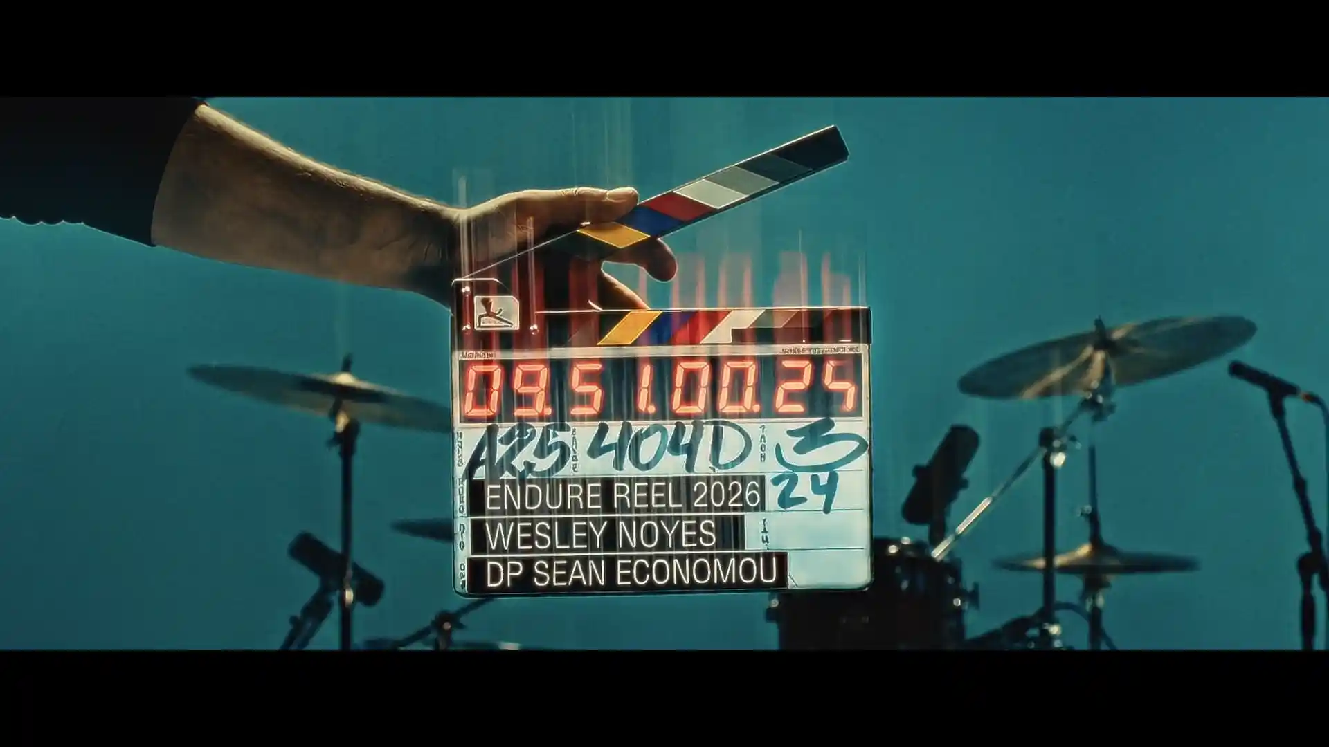
- VIDEOGRAPHY
- FUNNEL ARCHITECTURE
- COMMUNITY PLATFORM
- LIVE EVENTS
- MARKETING
- WEBSITE UX/UI
- SWAG
- STATIONERY
- WAYFINDING
- SIGNAGE
- PRINT DESIGN


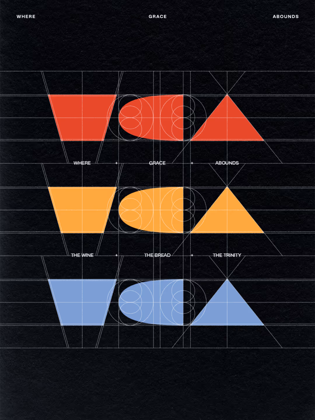


37 Years, Reawakened
Most legacy ministries don’t fail because they stop caring. They fail because they stop translating. A 37-year ministry received a full visual and digital revitalization without abandoning its theological gravity or alienating its core community.
Generational Trust Restored
When people are uncertain, wounded, or spiritually disoriented, confusion costs connection. A clearer digital front door increases the odds that the right people actually take the next step. A new website, clearer messaging, and renewed visual identity created a simpler pathway into Thursday nights, resources, leadership, and community life.
Community Renewed
Rebrands can fracture fragile communities. This one did the opposite. It refreshed perception, strengthened internal confidence, and gave the ministry fresh energy without compromising trust. The refreshed identity and rollout generated strong praise and affirmation from the existing community, easing a major concern around alienating long-time supporters.
Brand New Reach, Same Heart
Post-launch, the ministry saw increased relational momentum through more outreach, more coffee meetings, more connection points, and renewed engagement across generations. The goal was never cosmetic applause. It was movement. More conversations, more invitations, and more participation signal that the brand is now doing what it should have always done: helping people find their way in.


This is with the understanding you have the financial altitude to invest (not just survive), then you’re squarely in our sweet spot. We’re comfortable above or below that range, but our best work happens when the stakes are real and you’re serious about long-term growth.
We’re not trying to be the cheapest; we’re priced to deliver work that actually moves revenue, not just decorates your feed. If the budget is tight, we adjust scope, not our standards.
Instead, we define success with you up front, build a clear path to it, and track the metrics that tie the investment back to pipeline and revenue.
We start with a focused, paid strategy sprint that lets you see how we think before you commit to full production and you own that thinking either way.
Our clients call us in when the cost of getting it wrong is higher than the savings from going cheap. Product launches, key campaigns, and moments that actually move the needle.
If what you really need is a vendor who’s done the same thing 20 times before, we’re probably not your shop. Our clients stick around not because we understand their industry but because we find creative ways to reroute, redesign, or outright destroy their issues.